As touched in Part 1, adaptive design requires an understanding of viewports and their pixel layouts. In this article, we explore how adaptive design works, what is adaptive coefficient and how to calculate adaptive coefficient for an application.
What is Adaptive Coefficient and Adaptive Design?
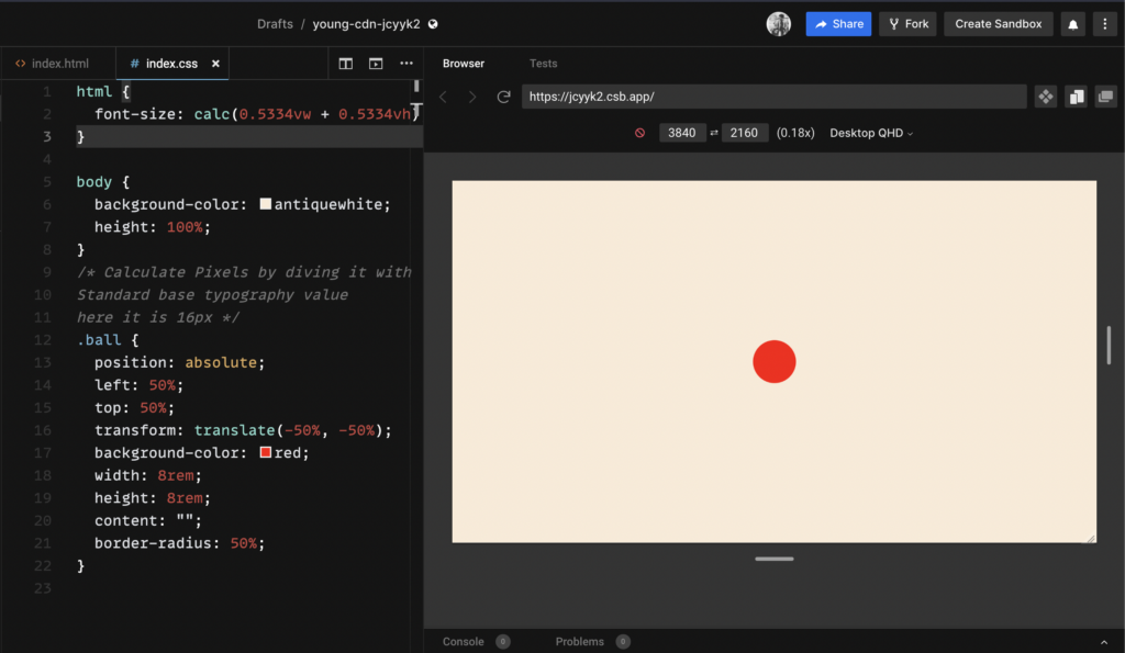
Here, we use relative styling unit REM to style elements. REM points to the root font-size i.e HTML font-size, therefore, we define this font size using the CSS calc() method with relative style units Viewport Height (vh) and Viewport Width (vw).
html{

font-size: calc(Xvh + Xvw);

}
X here is the Adaptive coefficient.
The reason behind changing the HTML font size is that in all other relative styling units the vh, vw, and % are calculated by the browser and the proper design values are not maintained as well as controlled by the developer. HTML font size has a default value of 16px but our design team may have a different base variant let’s say 25px. With this formula, we try to tell the browser to calculate the base typography variant based on the fraction of viewport height and width. The resolution of devices may change; however their viewport height and width will always be a maximum value of up to 100 units.
In any design system, Typography is the most important definition to look at before designing any component. This is because the base typography variant acts as a standard value and all other typography variants, element sizes, and component design values can be derived from the base typography font-size value.
Let us see the adaptive design in action with an example.
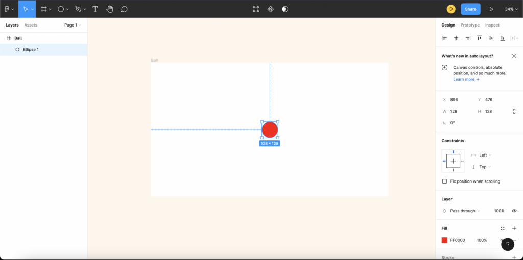
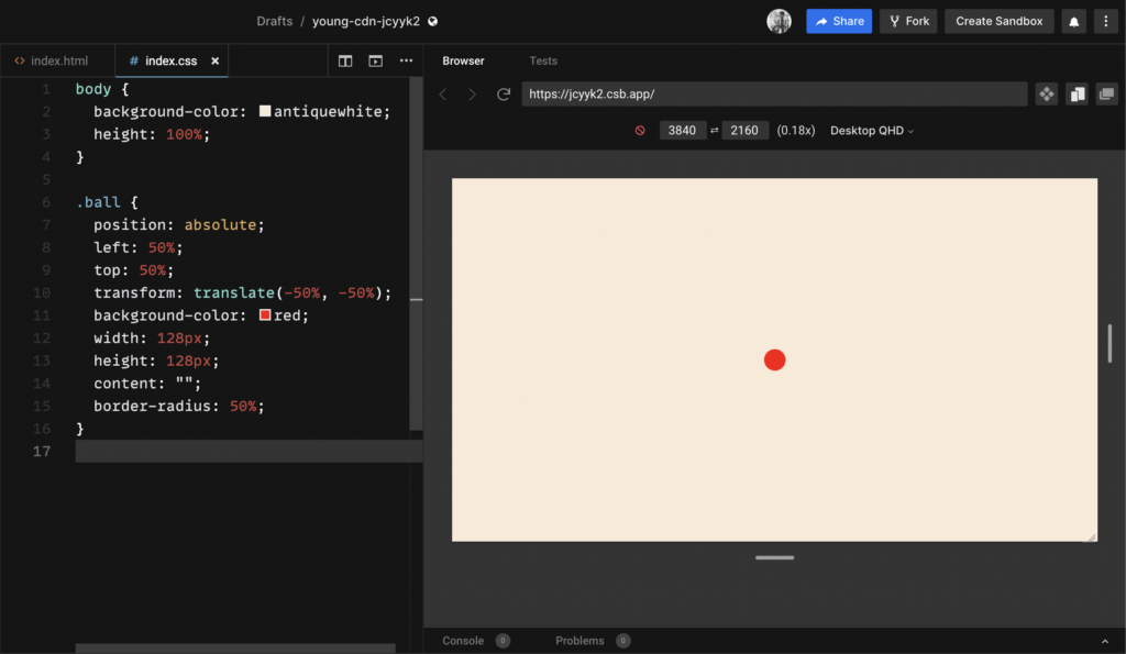
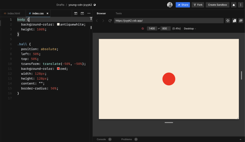
We have a red ball whose dimension is 128px * 128px for 1920px * 1080px system.
The ball looks smaller in higher screen resolutions and bigger in smaller screen resolutions.
App for 3840px * 2160px resolution:
App for 1400px * 800px resolution:
It is clear that as we introduce more pixels elements get smaller, and in lower resolutions, they get bigger. As the design gets more complex things look messier. In the smaller resolution, we may start getting unwanted scrollbars and in bigger resolutions, we might get unused white areas. Since we are ruling out the use of media queries let’s see what changes using dummy (calculation explained later) Adaptive Design Values.
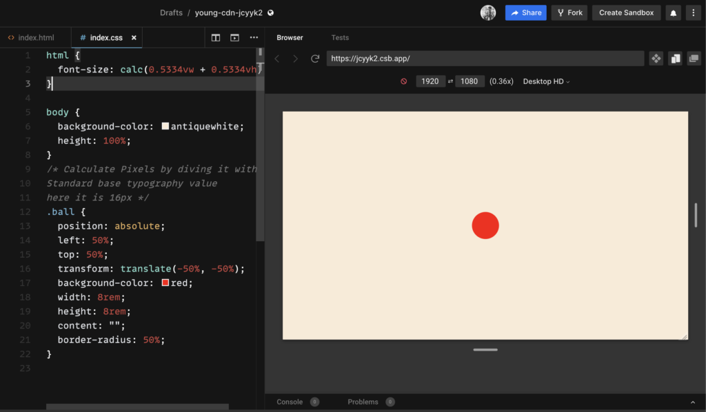
App for 1920px * 1080px resolution – With Adaptive Design Values:
App for 3840px * 2160px resolution – With Adaptive Design Values:
The elements resize and reconstruct themselves, whenever their container, i.e. the device screen changes. This is the reason why it is called adaptive design.
How does Adaptive Design work?
html{

font-size: calc(Xvh + Xvw);

}
Let us look at the following illustration to understand how this formula works.
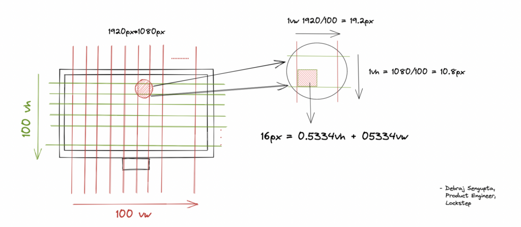
Each viewport’s height and width can be divided into 100 units. Let us take a quadrilateral area from the viewport of 1vh and 1vw. This area will have 1vh * 1vw amount of pixels. Our aim is to tell the browser to set the font size to a relative value of 16px instead of a fixed 16px.
After we pick the quad area from the viewport we need to find a smaller area that has sides whose summation of one length and breadth is exactly the same as that of our base variant. The fraction that we use to calculate the sides is called the “Adaptive Coefficient.”
After we find that area, we tell the browser to set the relative font-size as the summation of one length and breadth of our resulting area. Since this quad area is a relative unit with respect to viewport height and width, its fraction will always yield a value that is dependent on both the height and width of the viewport, and hence this responsive value will auto calculate itself even the aspect ratios change over different devices.
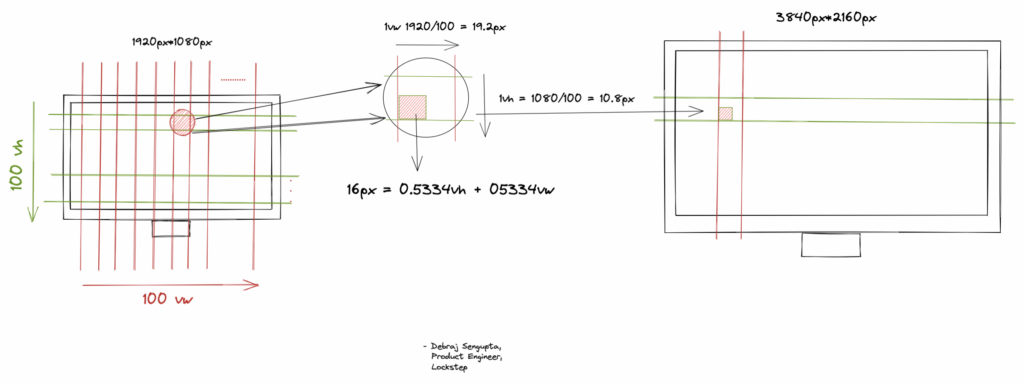
We also see that this quad area ,when calculated on a bigger screen, will acquire more pixels instead of keeping only 16px. This pixel amount is in the same ratio to which our base variant of typography was measured against the resolution of our standard design. The vice versa is done when it is being calculated on a smaller screen.
After the base font is set, we have to use rem values throughout our application as it takes 1 unit of the root font size. This design system is sustainable for future typography changes as well, we just need to recalculate the base adaptive coefficient and the system will auto adjust everything on its own.
This way, adaptive design creates a responsive design system by eliminating unmanageable large style sheets and introducing clean sustainable design which is immune to any resolution.
How to compute adaptive coefficient for an application?
We take a design prototype built on 1440px * 900px resolution to calculate our adaptive coefficient.
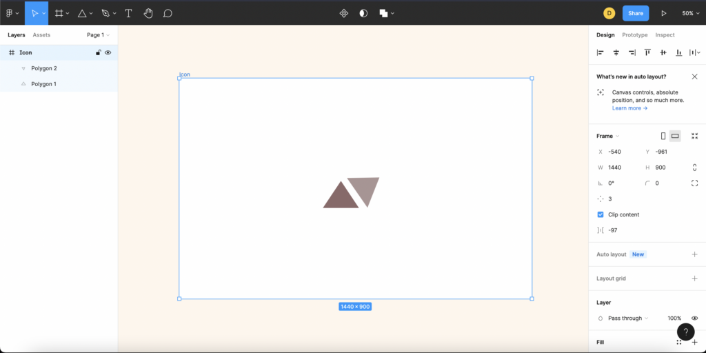
Step 1: Get Design Dimensions
From our design prototype we can get the canvas dimensions as below :
$Width = 1440px$

$Height = 900px$
Step 2: Get Viewport Dimensions
As mentioned above, every viewport can be expressed in relative measurements of vw (Viewport Width) & vh (Viewport Height).
1 Complete Height of Screen ( *of any px size ) = 100 vh

1 Complete Width of Screen ( *of any px size ) = 100 vw
Step 3: Get Base Variant of Typography
We know that in the adaptive design formula, X and Y are the adaptive coefficients.
html{
font-size: calc(Xvh + Yvw);
}
Adaptive design expresses everything as a function of vw and vh (where X and Y are equal factorial coefficients of vh and vw respectively) by changing the base HTML font-size.
Note: We consider X and Y equal because we want to resize the elements with equal impacts from the change in height and width of the device screen.
For the ease of calculation, let us consider the design’s base typography variant to be the HTML’s default 16 pixels.
Base Font Size = 16px
Step 4: Substitute and Derive the final equation
We have the formula but we mentioned that, X and Y are equal factorial coefficients of vh and vw respectively:
Xvh + Yvw = Base Font Size Xvh + Yvw = 16px
Which means that:
$X = Y$
By substituting the above, we get out the final formula:
Xvh + Xvw = Base Font Size Xvh + Xvw = 16px
Step 5: Calculate vh and vw for 1 unit.
We all know that each viewport’s height and width can be divided into 100 units. To calculate for 1 unit of vw, we know for our current design layout: 100vw = 1440px. Therefore, 1vw = 1440px/100 = 14.4 pixels.
Similarly, for 1unit of vh, we know for our current design layout: 100vh = 900px, Therefore, 1vh = 900px/100 = 9 pixels.
Step 6: Substitute vh and vw values to find X.
Based on the steps above, we have our final formula:
$Xvh+Xvw = 16px$

$X*(1vh + 1vw) = 16px$

$X = 16px/(1vh+1vw)$
By substituting values of vh and vw, respectively, we get:
$X = 16px/(14.4px+9px)$

$X = 16px / 23.4px$

$X = 16/23.4$

$X = 0.6838$
Hence, our adaptive coefficient is found to be 0.6838. Therefore, the HTML font size should be set to: 0.6838vh + 0.6838vw, resulting in the final CSS being set to:
html{
font-size: calc(0.6838vh + 0.6838vw);
}
Adaptive design is not a property of CSS but a retake on managing pixels based on the client’s screen. The biggest difference between fluid design and adaptive design lies in making the elements responsive – while fluid design mainly focuses on freely flowing layouts, adaptive design focuses more on the overall responsiveness of the system. Adaptive Design also enables us to write cleaner CSS, which is manageable, maintainable, and easier to understand. This provides a rich sustainable system that is not prone to future changes. This dynamic system is easy to develop and adaptable to future changes in terms of design specifications.
Want to test for yourself? Try this sandbox environment to sample an implementation of adaptive design.
Blog by: Debraj Sengupta, Lockstep


